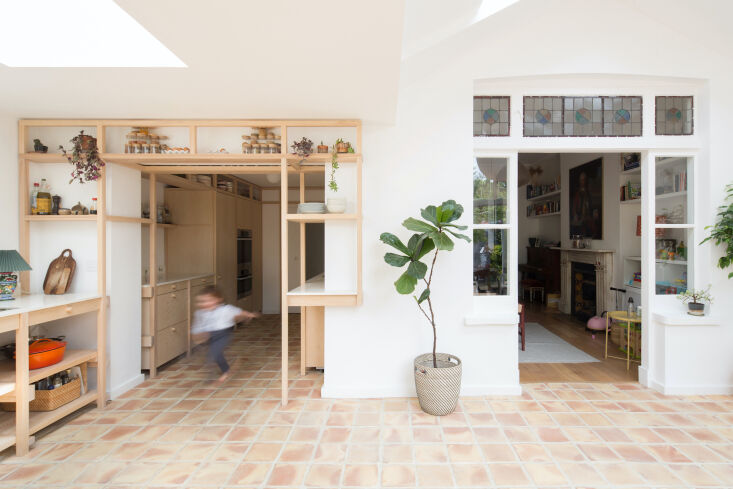
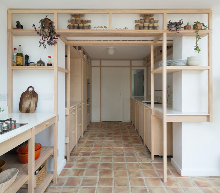
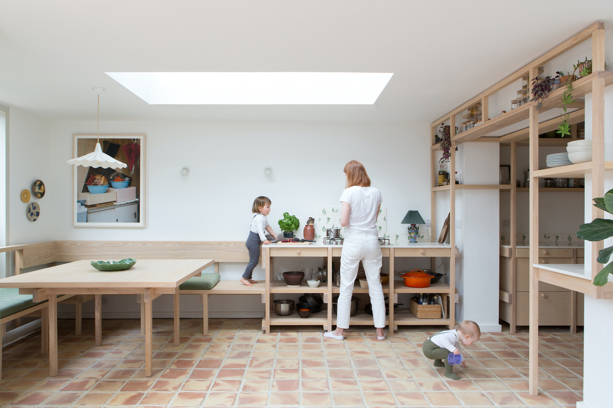
Here’s a kitchen that thoughtfully references the period and place the home was built (sometime in the 19th century, in London), yet feels thoroughly modern. It belongs to ceramic tile designer Sophie Caulfeild and her husband, James, a fund manager. The two hired architect Thom Brisco, of Brisco Loran, last year to brighten, update, and customize it for their busy life with two young daughters. “We wanted to have more seating in the lightest part of the house (the extension), to improve the look of the extension from the outside, and to improve the connection between the outdoors and indoors. It’s a north-facing room and it was very grey so we wanted it to feel a lot warmer,” Sophie reports.
In designing the new kitchen, Thom took his cues from what was already there: “Much of the design emerged from our observation of the house’s historic window and door framework. We looked to emulate the lacy qualities of its joinery with a timber framework of our own.” But instead of gutting everything and replacing it all, Thom and his clients were determined to minimize waste and “to work with what we had,” he says. “Ours is a project of many small tweaks and measures producing a new comfortable whole, without resort to wholesale replacement.”
Some examples of their conscious efforts to salvage and reuse: “Brickwork that was removed to reshape a door would become the new sill of an incoming window. The faulty porcelain floor that we took up was moved to the garden, where it became the base material for the new garden patio,” he shares. “In addition, several of the appliances in the former kitchen were retained and reinstalled in the new fit-out, whilst the old cabinets became a resource for the builder’s other projects across London. Whilst of limited impact, these small moves are examples of our necessary shift toward a circular material economy.”
Below, the results of their considered, waste-conscious renovation.
Photography by Agnese Sanvito, courtesy of Brisco Loran.


