Architecture studios Buckley Gray Yeoman and White Red Architects have redeveloped the flagship store of British furniture brand Heal’s in London, expanding the shop and adding workspaces.
The studios redeveloped the site on Tottenham Court Road in central London, which has been home to the Heal’s brand for more than 200 years.
Recently reopened, the development aims to connect the group of eight building on the site including Heal & Son’s original factory, workshops and warehouses from the 19th century along with its expansions in the 20th century.
“The team are most proud about the new spatial strategy, the transformation of a convoluted mish-mash of spaces into a coherent holistic vision across the site,” Buckley Gray Yeoman senior associate Nick Wharton told Dezeen.
The team expanded the retail space so that it now occupies the entirety of the ground and lower ground floors of the main street-facing block.
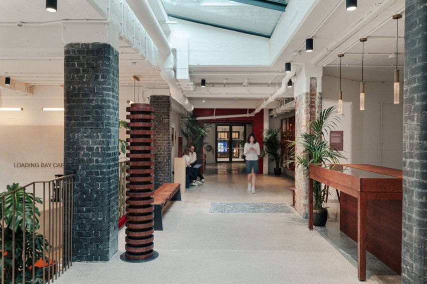
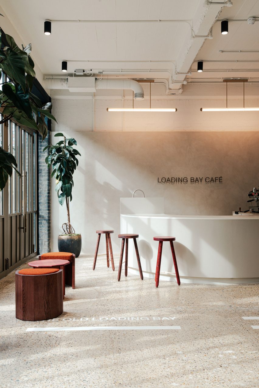
Alongside the store, a cafe was created in Heal’s previous warehouse loading bays, which also acts as a reception and public entrance to the workspace areas.

“The intention was to turn unloved service entrances into a new entrance for the refurbished building, whilst harking back to the charm of the historic streetscape,” said Wharton.
“Metal roller shutters and other unsympathetic modern additions were removed and replaced with full-height glazing to create a bright and lively reception and cafe space within the old loading bays.”

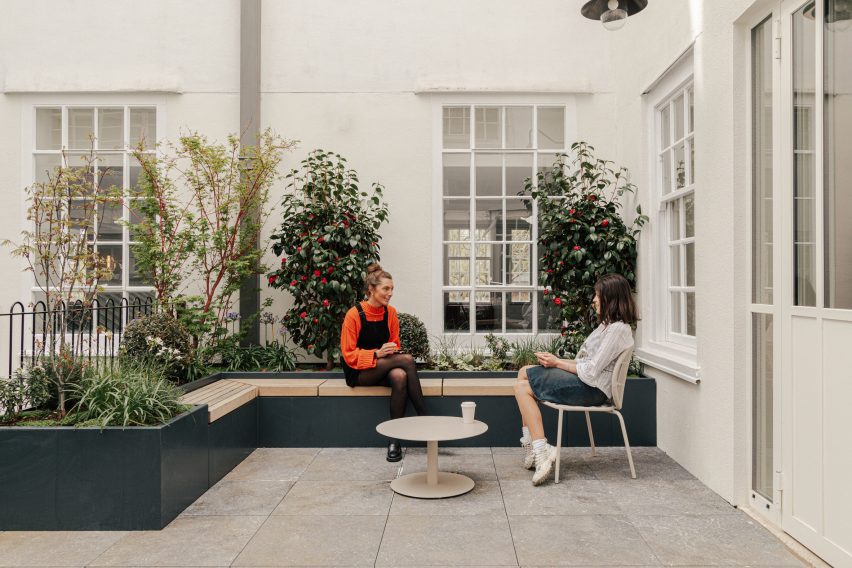
The cafe on Alfred Mews, which has outdoor seating, leads to 13,000 square metres of workspace spread across the numerous buildings’ upper floors.
“The concept for Alfred Mews was to create a vibrant and inviting streetscape that reflects the dynamic nature of the new workspace campus,” White Red Architects director Jesus Jiminez told Dezeen.
“It is now a space that encourages interaction and fosters a sense of community. A light touch intervention that incorporates a mix of planters, outdoor seating, and new wayfinding, all intended to create a welcoming environment.”
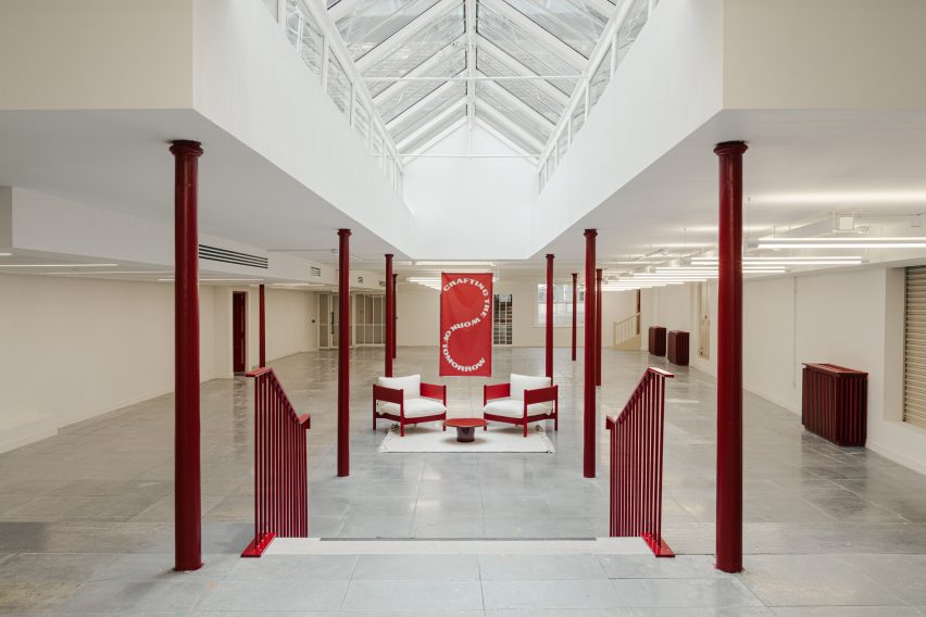
An “internal street” running across the site from Alfred Mews to Torrington Place acts as a public space for flexible break-out space for meetings with in the office space.
Throughout the offices, deep red industrial screen doors and circulation areas provide a distinct colour motif, contrasting with the surrounding neutral palette. Workshop machinery and decorative plastering feature throughout.
Referencing original site artefacts, bespoke sculptural works by Yorkshire-based furniture designers Galvin Brothers also adorn the interiors of this new development.
These include abstracted springs, a nod to Heal’s factory origins manufacturing the world’s first sprung mattresses, with smaller objects referencing tools and chair legs.

“Our goal when working with existing buildings is always to retain as much of the historical fabric as possible,” said Wharton. “Any new features were kept purposefully minimal and functional to avoid taking away from the character of the original building.”
“Within the Heal’s building we uncovered and restored a number of original features, such as the fire shutters with their fantastic brass circular handles,” continued Wharton.
“We also used found items throughout the project, such as the old goods lift doors which were repurposed as wall cladding behind the reception area.”

Throughout the development, developer General Projects aimed to maintain and build upon the history of the Heal’s store.
“Our vision was to future-proof this iconic department store building whilst retaining its character and the stories, incorporating the Heal’s store as an anchor tenant at the heart of the scheme,” General Projects’ director Ben Cross told Dezeen.
“This building is more than just bricks and mortar, it’s part of Britain’s cultural fabric. And we want those stories to continue to be written.”
Other department store redesigns featured on Dezeen include Jenners in Edinburgh by David Chipperfield Architects and KaDaWe in Berlin by OMA.
The photography is by Chris Wharton.
